Write.io
You’re really good at what you do. We help you do it even better.
write.io is an online literature study tool that helps people/teams in the process of researching and reviewing existing literature (such as scientific studies, journals, articles, and reports) related to a specific topic. It enables researchers to create and manage their projects, search for published articles, curate papers, collaborate on draft creation, review drafts, and ultimately publish the document.🚀
Please note that I couldn’t share the original UI due to NDA restrictions. The UI I have shared here is my own concept UI.
🎨 MY ROLE
Entire product design from research to conception, visualization, Design System, and Interaction
🔥 TOOLS AND METHODS
Figma, Illustrator, Protopie, User Interview, Competitive Analysis, Usability Studies, Affinity Diagram
⏳ PROJECT TIMELINE
March 2020 - Ongoing Project
What is Literature Study?
Literature study refers to the process of researching and reviewing existing literature (such as scientific studies, journals, articles, and reports) related to a specific topic. The purpose of a literature study is to gain a thorough understanding of the current state of research on a given topic and to identify any gaps in knowledge that may exist. This information is then used to inform the development of writing projects, study reports, and publications.
The writing team will also use the literature to ensure that the information in their documents is up-to-date, accurate, and relevant.
Product Discovery
How did we land on the problem?
The organization already had a literature writing team(in a different location), and they were facing a lot of difficulties while creating a publication.
I conducted a brainstorming workshop with the team(PMs, Research team head) to uncover the pain points felt by individuals. The main objective was to gain more knowledge of the literature publishing sector.
From the workshop, It was relevant that:
Most of the publication platforms are very complex to use
The review process is very naive or not even handling in some of the products available
Collaboratively working on a project is not possible.
Too much cognitive load for the user while handling multiple databases in multiple tabs.
How can we help researchers publish their articles within a single platform?
During this discovery phase, we learned the essential features that must be present in the product in order to build an effective platform for solving the above issues. The application should be intuitive and easy to use, focusing on simplicity and efficiency.
Design Process
Revamped Double Diamond Process
I got inspired by the Revamped Double Diamond Design Process(By Dan Nessler) since it pretty much explains each stage clearly. Since this product is creating from scratch, and I had zero knowledge of the publication industry, I was extra careful during the initial time. Unwanted assumptions or interpretations might lead the entire team to work in the dark.
HCD Process
Once the product is established with core features, sub-tasks were done with the HCD process.
Why? Avoid UX Blasphemy(All the new features need not go through the same design process).
Research Phase
Interviews
Competitor Analysis
Research & Observations
1
Ideation Phase
Insights & Brainstorming
IA, Breadboarding
Prototype + Interaction
Usability Tests, A/B tests
2
Delivery Phase
High-Fi + Interaction
Specifications
Style guide(If any new)
3
Research
I needed to understand the market and its users before diving right into the action.
I had absolutely no knowledge of the Literature Publication Industry or how the system operated because I was primarily working on web and mobile applications for the digital industry. Daily meetings and discussions greatly helped us to explore more about the challenge. The organization's medical writing team dispelled any remaining uncertainties.
Interviews
🙋♂️
With users in the Literature Publishing team
We had done the interview with 4 people from the team in our organization and 3 people from the research team of one of the world’s biggest pharmaceutical companies.
🤝
With Chief Scientific Officer and Team Manager
The main agenda of this interview was to find out the pain-points from a team managing level person.
“During the interview phase, when users described their pain points and frustrations, this initial investigation helped me connect and gain a better understanding of the current market and user problems.”
Competitive Analysis
In order to construct a concise and solid foundation for write.io, I had to venture out and see what the prominent publishing applications were already doing and what user goals they were not reaching. I evaluated several features deemed vital by the literature writing team, and online research and identified which ones our product could capitalize on to have a leg up over other applications.
I found that none of them were providing a collaborative editor and inbuilt database search. The Platforms are flooded with features that make the UI too complicated.
Data Analysis
Once we have done the primary and secondary research, it was time for analysing the research data we gathered. In this phase, we tried to turn the raw data gathered into valuable insights. We have done a brainstorming session with the product PMs and Chief Scientific Officer in the organization to interpret the user needs from the research data.
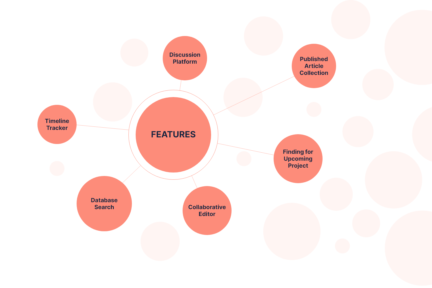
The main agenda of this phase is to create a base and define the product you’re designing and set our initial priorities(based on interviews and research), and most importantly How Might We solve the problems. With the help of UI Engineers and system architects and PMs, we were able to set priorities.
Task flow (from creation to publishing of literature)
Message/Discussion platform
Already published articles repository
A platform for creating drafts and findings
Simple and intuitive collaborative editor
Common platform for searching online sources
Timeline tracker
Affinity Diagram
With the findings from Interviews, Research, Competitive Analysis, and Data Analysis, core features are shortlisted and prioritized according to the timeline.
Breadboards
The complete breadboarding process was done in draw.io. This is a great platform with super-rich tools to enhance your workflow. The only drawback I found in this software is the UI is very basic.
-
breadboarding is a concept introduced by Ryan Singer in his fantastic book Shape Up: Stop Running in Circles and Ship Work that Matters. Borrowed from the world of electrical engineering, a breadboard in this context refers to a model that displays all the necessary components of a product and how they connect, without determining how they’ll be displayed. The bones are there, and the connections between them, but there is no set arrangement or skin.
Keeping those details undefined allows us to **focus on the logic** and functionality of a product experience.
Low-Fi
Wireframes
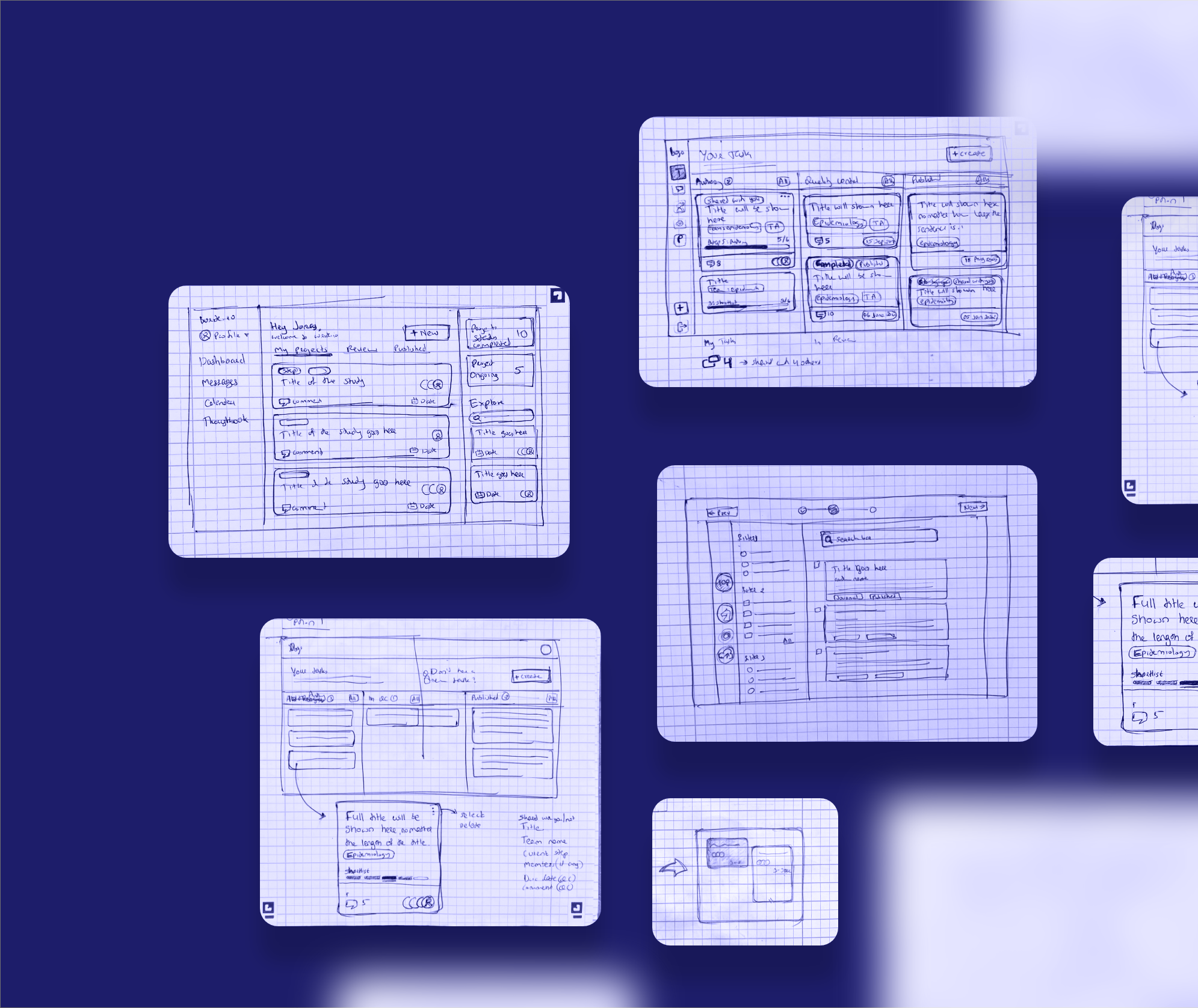
Before moving onto mid-fidelity, high-fidelity wireframes and mocks, I wanted to get a feel for what the core of the app would look like when put in front of me. Without much effort, adjustments could be made before going into the much more costly digital implementation.
I lead the team in quickly communicating each stage of the product by sketching it on a paper
Mid-Fidelity prototypes
After completing the low-fi wireframes, I moved on to creating mid-fidelity prototypes. In this phase, I established the navigation layout and mapped out the user flow. I presented the team with more precise representations of the layout than low-fidelity wireframes while avoiding unnecessary elements such as images or typography.
Mid-fidelity wireframes are an effective way to gather feedback on the overall design concept before investing time in creating more detailed high-fidelity wireframes. During this phase, I regularly consulted with the literature publishing team and project managers and collected their feedback on the usability of each feature.
300+ screens were made during this initial process.
I'm happy to share more information regarding this phase in person, the results of the usability tests, and the final decisions that were made.
FINAL
PRODUCT DESIGN
write.io
Just before the final designs
Choosing color palette
When it comes to design, I believe color is considered to be one of the most important aspects. Colors can evoke certain emotions and feelings, and they can also be used to guide the user's eye to the most important parts of the interface.
A research made by CCICOLOR says that users only take 90 seconds to make a judgment about the quality of a product. Therefore, it is important to choose the right colors before designing a user interface so that it can create an engaging experience for users.
Landing Page
Here, the dashboard is divided into three panels.
Left Panel:
This panel is mainly for navigating through different sections of the product.Middle Panel
Focuses on the contents where the user can interact withRight Panel:
Overall status and new Updates
Discussion Platform
The messaging feature is implemented in the application, allowing users to initiate discussions or share their thoughts within the platform, either as a group or individually. This helps to keep all communication and interactions contained within the platform.
Detailed breakdown
Despite being a concept UI, I took the time to ensure that the design was pixel-perfect by breaking it down into various levels and performing precise calculations.
Quick Heads up🧨
The entire process, from creation to publication, is very complex because of the sub-features associated with it. So we used the wizard bar to divide the complex process into multiple steps, thereby reducing the cognitive load for the user.
Users end up being less overwhelmed by the process.
Less cognitive effort is spent in completing the process.
Users make fewer mistakes.
More screen real estate is available for each step.
STEP 1 OF 3
Project Kickoff🚀
The information required to begin the project is gathered here. The option to add collaborators will only be displayed if the user expresses interest, thereby conserving space and minimizing cognitive burden for the user.
STEP 2 OF 3
Add Sources📁
Without leaving the platform, users can search and shortlist the articles needed for the project from their favorite and commonly used online databases.
Additionally, a feature has been added that allows users to upload articles that have already been downloaded to their local system during usability testing.
STEP 3 OF 3
The Editor🔥
I was extra careful while designing the editor for the product, as it is a critical component. To ensure its success, I extensively researched various editors (such as Zoho, Dropbox, and Google Docs) and consulted with engineers and the publishing team throughout the process.
From the initial brainstorming session, I recognized a key user issue: the absence of a split-screen feature.
With this feature, users can now write their projects and view source articles on the same screen simultaneously.
Tracking the tasks
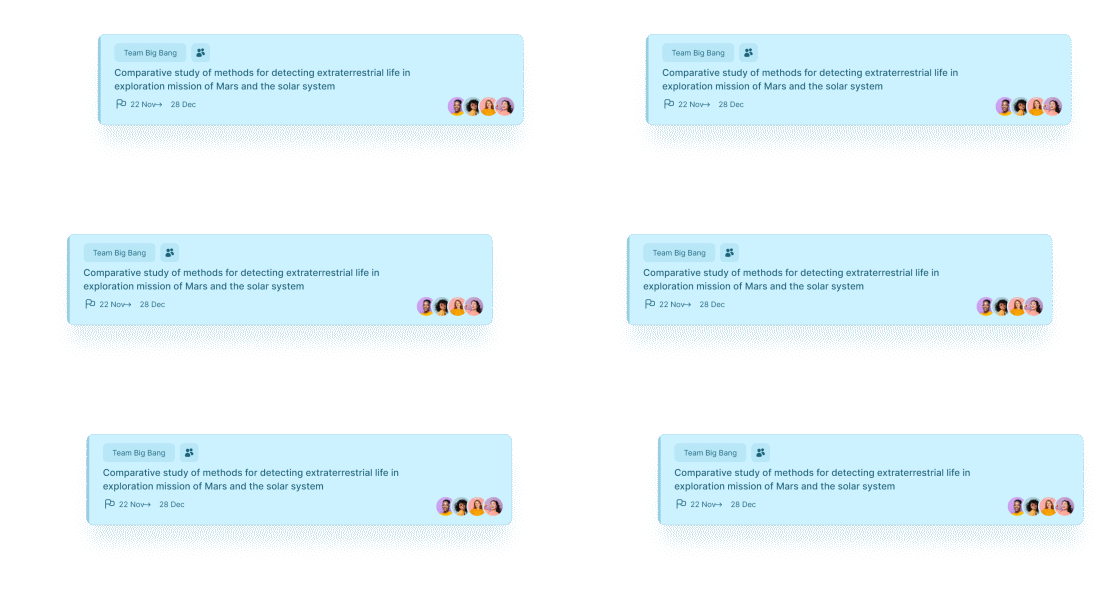
For tracking the tasks, I designed a monthly calendar and integrated the user’s created project and review project with different colors. This helped users to track and manage their timeline effectively.
Thoughtbook
Users can create draft notes for their upcoming projects or side projects and share them with others. Within a thought book, they can also create a plan or checklist, and add relevant images, links, etc.
Additionally, users can convert their thought books into projects as necessary.
Further Breakdown
Live Collaboration
Active user locations are highlighted in the UI to prevent editing conflicts among collaborators. This also enables users to easily identify who is working on which sections.
PDF Features
All necessary tools for PDF functionality are available within the platform, making communication between writing and reading easy.
AI driven content
Activation pills have been introduced to aid users in utilizing AI-driven insights from PDFs.
Motion Design and Micro-Interactions
Micro-interactions play a major role in modern UI design and are crucial because they provide feedback and guidance to users, making it easy for them to understand and interact with the interface.
They also add a level of polish and delight to the user experience, making it more engaging and satisfying. Micro-interactions can help users understand the system's state, provide context-aware actions, and create engaging experiences. They are small details that make a big impact on the overall user experience.
A/B & Click Tests
To quantitatively review the usability assumptions, I did A/B and click tests(with the literature writing team) through which I made iterative improvements to the design when necessary. All the features haven’t gone through this A/B testing, only the features where the team had different opinions went through the process.
Even when I did this concept design, I made two versions of the landing page and gathered feedback from the team.
Heatmaps
Additionally, With the help of attentioninsight.com, I was able to track and identify areas of interest and user behavior in the UI.
The following results of the design analysis were generated using an AI deep learning algorithm trained with 30800 images from real eye-tracking studies. Thus, the algorithm can simulate human vision with 90% accuracy within the first 3-5 seconds of interaction.

Design System
I referenced the Atlassian Design System and Google’s Material Design System, and used them as a foundation to identify the design tokens that the product needed. I created every design component from scratch. I collaborated closely with the Engineering team to design a cohesive and easy-to-use system that they could reference and implement with ease.
Design Delivery
I separated different parts of the product design into specific Jira Tickets, this way the developers could keep track of the design changes needed. Any implementation problems, design changes, and general questions could be said on the tickets and made organizing the entire UI/UX redesign much smoother.
The Impact
The MVP turned into a massive product with improved features and new requirements and the team count itself increased by 100% for this particular product.
INITIAL FUNDING$1.4m↗
With the MVP, the organization was able to get one of the world’s biggest pharmaceutical companies, and currently, the product is live in their system. A lot of new features are getting implemented in the product.
COST Savings30 - 50%
The implementation of advanced features and collaboration in the product has increased employee productivity and reduced resource requirements for each project, resulting in reduced costs per project.
Time Savings40 - 70%
Overall time saving is reported when publishing a project within the platform. This means that the process of publishing a project within the platform is significantly more efficient than other methods, potentially saving a significant amount of time.
Takeaways
As the sole product designer working on this massive project, I am incredibly proud of my accomplishment. The experience was incredibly rewarding as it allowed me to experiment with new tools and techniques, which helped me to improve my skills and develop my craft as a designer.
Additionally, the scale and complexity of the project provided a unique opportunity for me to challenge myself and push my abilities to the limit.
Not only did we achieve a successful outcome for the product, but my personal growth as a designer was evident. It was an opportunity to prove myself and showcase my abilities, and I am grateful for the opportunity to have been a part of such a significant project.
Next Project
MOBILE / UI / UX
Table Booking App
Design of a mobile application for reserving tables and discovering the latest menu offerings for Villa Maya restaurant.


